Mobil view suggestions

Snitz™ .NET Core
https://www.reddick.co.uk/mvc/Topic/Posts/7336?pagenum=1
6/29/2025

Topic


Torborg
Mobil view suggestions
2/25/2025


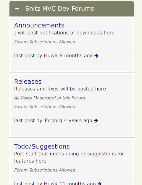
I think the white space between forum title/description and "by username" is confusing. If we remove that space it is easier to see that these elements belongs together. I also think "Forum subscription allowed"  or if a forum is moderated is unnecessary information here, but if it has to be here it could be below "the post by user" text.

I also think there must be more text then "by Huwr". "Post by" or "Last post by" / "Latest post by" is better


Replies ...


HuwR
2/25/2025


 I also think "Forum subscription allowed"  or if a forum is moderated is unnecessary information here, but if it has to be here it could be below "the post by user" text.

These can be turned on/off

HuwR
2/25/2025


I think the white space between forum title/description and "by username" is confusing.

This is just cosmetic you can style it how you want.

Torborg
2/27/2025


Ok

HuwR
3/6/2025


You can change it easily, to remove the gaps (like below) you just need to add some css


I just added this css override 😃

    .subforum-column {
margin-bottom: 0px;
}
.subforum-info.subforum-column {
margin-top:0px;
margin-bottom: 3px;
}
HuwR
3/10/2025


made a few tweaks for mobile layout here

Torborg
3/19/2025


Nice 😃

HuwR
3/22/2025


Still making a few tweaks for mobile, so shout if you notice anything weird or have suggestions

© 2016-2025 Snitzâ„¢ Forums MVC