

I also think "Forum subscription allowed" or if a forum is moderated is unnecessary information here, but if it has to be here it could be below "the post by user" text.
These can be turned on/off
I think the white space between forum title/description and "by username" is confusing. If we remove that space it is easier to see that these elements belongs together. I also think "Forum subscription allowed" or if a forum is moderated is unnecessary information here, but if it has to be here it could be below "the post by user" text.
I also think there must be more text then "by Huwr". "Post by" or "Last post by" / "Latest post by" is better
I also think "Forum subscription allowed" or if a forum is moderated is unnecessary information here, but if it has to be here it could be below "the post by user" text.
These can be turned on/off
I think the white space between forum title/description and "by username" is confusing.
This is just cosmetic you can style it how you want.
Ok
You can change it easily, to remove the gaps (like below) you just need to add some css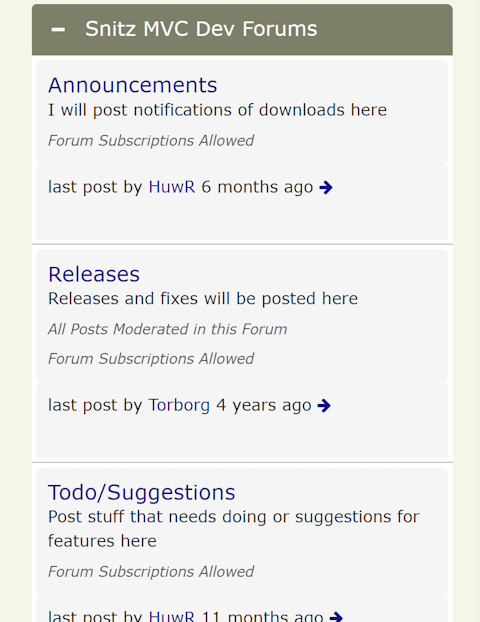
I just added this css override ![]()
    .subforum-column {
        margin-bottom: 0px;
    }
    .subforum-info.subforum-column {
        margin-top:0px;
        margin-bottom: 3px;
}made a few tweaks for mobile layout here
Still making a few tweaks for mobile, so shout if you notice anything weird or have suggestions
If you're having problems uploading, try choosing a smaller image.